

A homeowner in a 300-square-foot apartment once described her living room as feeling “like a hallway with a couch in it.” Furniture was pushed against every wall, leaving a dead zone of empty floor in the center and forcing anyone walking through to squeeze past the coffee table. The fix wasn’t more furniture, or less furniture. It was rethinking how the pieces related to each other.

That kind of layout problem is more common than most homeowners realize, and it’s rarely solved by buying something new. It’s usually solved by rearranging what’s already there with a clearer sense of purpose.
The Case: A Cramped Rectangular Living Room
The room measured roughly 11 by 16 feet, with a window on one short wall and the main entrance on the opposite side. The original layout lined the sofa and two chairs along three separate walls, all facing a TV mounted across the room. It technically fit everything, but nothing about the space invited people to sit and talk.
Guests would often end up standing near the kitchen doorway instead of sitting down, which is a common sign that a living room’s seating arrangement isn’t actually inviting people to use it the way it was intended.
What the Layout Was Getting Wrong
The furniture had no relationship to itself. Seating that doesn’t face or angle toward other seating tends to feel like separate islands rather than one cohesive area, no matter how nice each individual piece is. There was also no clear walking path, so guests had to navigate around furniture rather than through a defined route.
This kind of layout often happens gradually, one piece at a time, without anyone stepping back to look at how the whole room functions together. It’s an easy trap to fall into, especially in a rental or a first apartment where furniture accumulates piece by piece rather than as a planned set.
Lessons Learned From the Redesign
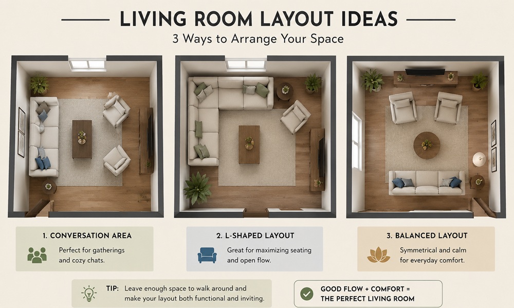
Pulling the sofa a few feet off the back wall and angling the two chairs toward it, rather than toward the TV, created an actual conversation area. The TV stayed in place, but the room now had two functions instead of one: a place to talk, and a place to watch something, both within the same footprint.
A rug helped anchor the new arrangement. All the furniture’s front legs landed on the rug, which visually tied the seating area together instead of leaving it feeling scattered across bare floor. This single change made the room read as one cohesive space rather than a collection of separate pieces.
Recommendations by Room Shape
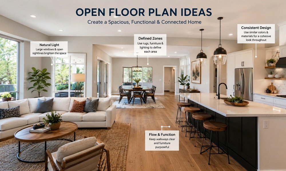
Rectangular rooms: Float the sofa away from the wall and use it to divide the room into zones, especially in open-concept spaces where the living room blends into a dining or kitchen area. This approach uses the sofa itself as a soft boundary rather than relying on walls that don’t exist.
Square rooms: A symmetrical layout, with matching chairs on either side of the sofa, tends to work best, since square rooms don’t have an obvious focal wall to build around otherwise. Symmetry gives the eye a natural resting point in a room shape that can otherwise feel directionless.
Small rooms under 200 square feet: Choose a loveseat or apartment-sized sofa over a full-size one, and consider a round coffee table, which allows for tighter traffic flow without sharp corners in the way. Every extra inch matters in a small room, and rounded furniture edges make a real difference in how easy the space is to move through.
Rooms with a fireplace: Let the fireplace anchor the seating arrangement rather than competing with the TV for attention; placing the TV above or beside the fireplace keeps both focal points working together instead of splitting the room’s attention between two competing walls.
How Do You Fix Poor Traffic Flow?
Walk the space the way you actually move through it daily, from the entrance to the kitchen, from the hallway to a favorite chair, and make sure furniture doesn’t block that natural path. Most rooms need at least 30 inches of clearance for comfortable walking space between major pieces, and less than that starts to feel cramped even in an otherwise well-designed room.
Should You Use a Symmetrical or Asymmetrical Layout?
Symmetrical layouts feel formal and calm, which suits smaller or more traditional rooms, and they’re often the easiest starting point for anyone unsure where to begin. Asymmetrical layouts, mixing a sofa with a bench or two different chair styles, feel more relaxed and work well in larger, more casual spaces.
Neither is objectively better; it depends on the mood you’re going for and the room’s natural proportions. A room with an off-center window or an unusual architectural feature often looks better with an asymmetrical layout that works with those quirks rather than fighting them.
Whichever approach you choose, it helps to live with a layout for a week or two before deciding it’s final. Traffic patterns and daily habits often reveal small adjustments, like a lamp that needs to move six inches, that aren’t obvious until the room is actually being used.